Studio Set Up
Posted: May 6, 2016 Filed under: Field Leave a comment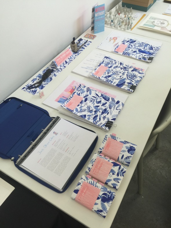
Following my actual project my attention turned to the way in which I would actually present my work. I decided to borrow the colour combinations from both my final project and from the CV I had created previously; pink and navy blue. The way I present my work is important to me and I always aim to present my work as professionally as possible. I borrowed the coloured pencil texture from my final project’s cover and designed a navy blue tropical pattern to accompany it.
Subject PDP
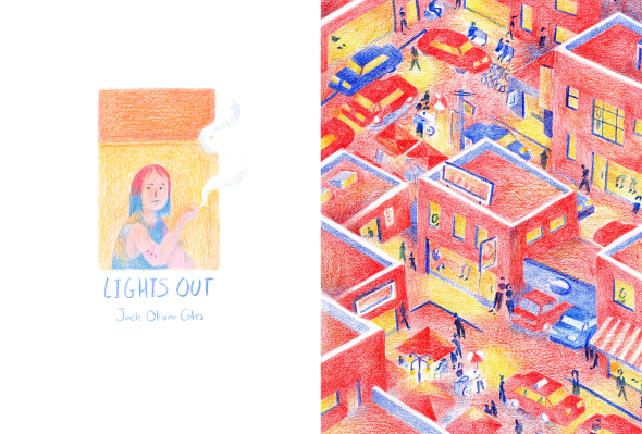
Posted: May 6, 2016 Filed under: Subject Leave a commentAs with constellation, subject at level six presented a challenge I felt ill equipped to deal with. My intention before the year started had been to complete several short projects over the course of the year in an attempt to prepare myself for the possibility of working editorially, sharpening my abilities to complete projects to deadlines by imposing my own. My lack of preparation over the preceding summer led to a long period of searching as the year started and I felt rather lost for the majority of term one. I reverted back to the inspiration of TED Talks as that had been my most enjoyable project okay level five and I quickly became overwhelmed with subject matter as I searched for the topic that could maintain my interest throughout the year. As I started working I quickly found that the multitude of tutorials meant that constant progress needed to be made and I I felt a pressure to invest my time into one extensively developed project. Beginning with a TED Talk telling the story of Syrian teenager I began developing imagery to illustrate a poem that he himself had written. As I progressed I began to realise that I felt uncomfortable putting a face to someone else’s words and felt that it wasn’t my place to tell their story to the world. I expressed my concerns and quickly moved on to yet another project. Lights Out ultimately ended in the same manner, though the path to the realisation was much slower and ended up consuming much of my time. I was happy with the images I was making, and I still am to some extent, and had multiple designs and layouts for the book.
It wasn’t until the Viva Voce however that it truly struck me how out of my depth I was dealing with someone else’s story. I decided to look to a different project from level five, my charity project, and quickly began correspondence with multiple charities in the hopes that someone would respond in order for me to negotiate a live brief with them. The National AIDS Trust ended up being the only organisation to respond and their interest in working with me reassured me that my decision to drop Lights Out was valid. I negotiated a project to illustrate a pre-existing presentation that the NAT used, telling the story of HIV/AIDS’ origins and the legacy it has left on modern history. Being able to work with external people gave me a sense of legitimacy as an illustrator and I found the enthusiasm expressed in each email spurred me on to create the best work possible within the timeframe I had negotiated. The work I created is some of my strongest, drawing from previous projects I utilised multiple methods of drawing to convey the narrative and found that having captions visible with images helped me feel confident that my images wouldn’t be misunderstood by the viewer.
Now that the end of my degree is in clear sight I have learnt the importance of trusting my own instincts and knowing when a project simply isn’t working as it should be. The majority this year was spent working on projects without finished, spent trying to force projects to completion that simply didn’t feel right, however I don’t feel that any of that time was wasted. I questioned my own position as an illustrator during both my refugee project development and Lights Out as I felt ill advised and out of my depth in trying to tell the stories of people whose lives are completely detached from my own, however I feel that working directly with the NAT has helped prove my ability to work in the real world. Moving on from university into the real world of freelance illustration is significantly less threatening and I feel that I have a good basis on which to build up an impressive portfolio.
Understanding HIV: An Illustrated Timeline of HIV/AIDS
Posted: May 6, 2016 Filed under: Field, Subject Leave a commentWorking with the National AIDS Trust i have created an illustrated timeline which traces the history of HIV/AIDS in the west and exposes the true scale of the issue that remains today. Having the opportunity to work on a live brief with a concrete context was a refreshing occurrence after my trepidation with both my refugee project and Lights Out and I found myself working furiously to create the illustrations to accompany the provided information. To suit the needs of the NAT I created a slideshow presentation featuring 33 illustrated events that covers from the first occurrences of HIV/AIDS in 1982 America to Cuba eliminating mother-to-child transmission of HIV in 2015.
Field – PDP
Posted: May 6, 2016 Filed under: Field Leave a commentThroughout the year the distinction between subject and field has continuously been blurred and at times it has seemed non-existent. As an illustrator my primary goal is to communicate to viewers and due to my experience of exhibitions my knowledge of them is of simply aesthetic value. We were told not to fixate on the exhibition during our project development and so I payed very little attention to the idea until it came to actually building the show. My final project was primarily developed be in the form of a slideshow presentation which would be utilised by the National AIDS Trust however I had doubts about how well it would work as part of an exhibition.
For the purpose of exhibiting my work I decided to turn the slideshow into a book, allowing the viewer to take in the information I have illustrated at their own leisure. This decision meant that I had to familiarise myself with InDesign which was facilitated by a tutorial with Georgina who helped set up the file and informed me of how to add my work. Through further discussions with tutors I realised how important it was to show my work in its intended form as a slideshow, meaning I would also have to get to grips with Premier Pro in order to add timing. The experience of exhibiting my work truly pushed my abilities and forced me to acquire new skills as the way in which my work would be experienced changed from a slideshow to a book and finally to an animated video.
Time planning continues to be an issue for me and my lack of prior planning resulted in my having to juggle the show build while also still working to finish my projects. Though the balance was difficult to maintain I found that the camaraderie fostered through the common goal of the exhibition meant that I could negotiate time to continue my work around the build thanks to my classmates. There was an atmosphere that I had never felt within the studios during field this year and being within that environment of activity and shared interest was a great motivator. Looking to the future I think it is important for me to find a group of creatives to work closely with or perhaps just a shared studio space as the mutual deadline brings out the best of my abilities. I had always been hesitant to talk to tutors, technical demonstrators and even many fellow students however the time pressure eliminated my hesitance and I simply had to do it. Confidence has always been an issue for me in regards to presenting myself as a professional and I need to continue making inroads in terms of networking with those around me.
On the whole, The Encounter really took me out of my comfort zone and I feel all the better for it. I approached my project from a variety of different angles, utilised skills I didn’t know I had and gained tremendous amounts of confidence in approaching others when I needed help. This term has truly been fast-paced, stressful and immensely challenging however, it feels like an appropriate climax for my undergraduate experience.
Brighton Open Day
Posted: April 23, 2016 Filed under: Field Leave a comment
Taking a short break from the end-of-year rush, me and two other illustrators travelled to Brighton to visit the University of Brighton’s MA Sequential Design/Illustration open day and hear Cardiff Met tutor Anna Bhutan give a talk. Having never visited before, I was excited to explore both Brighton and learn about the course itself. Brighton was a beautiful city, and the longer I was there the more that the prospect of residing there appealed to me. The teaching staff at the university were warm and welcoming and the campus felt comforting, reminding me of the hectic atmosphere in Howard Gardens. The course could be taken either as a full-time or part-time undertaking, lasting one or two years respectively, and we were told that the full time course was better for those with a specific project in mind that could be completed intensively and the part-time was better at facilitating a more relaxed, research based approach.
I came away from the open day unsure of my future intentions and feeling a little lost ambition wise. The application process requires candidates to submit a project proposal which intimidated me immensely following my year of being so indecisive about projects. Despite getting to a point where I am becoming more confident in my own practice the opportunity provided with the part-time degree would allow me to continue to explore where my ambitions lie which also allowing me to gain experience working alongside studying. Not only does the course appeal but the city itself seems like a great place to nurture my talents and grow as a person, and has become a serious consideration when I look to where I would like to end up in the future.
Within/Without Bristol Exhibition
Posted: April 15, 2016 Filed under: Subject | Tags: cardiff met, csad, illustration Leave a comment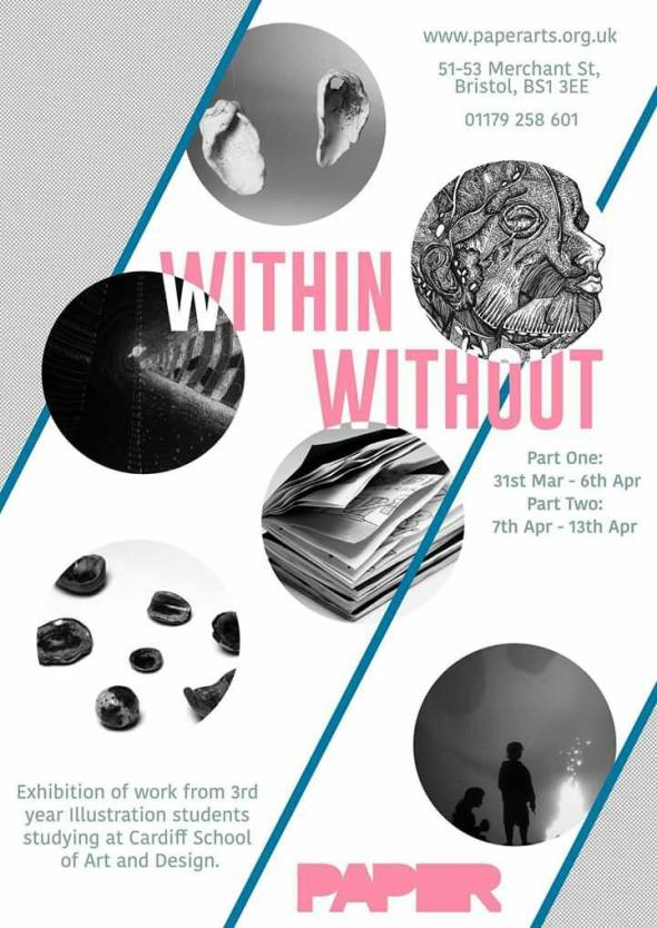 For several months I’ve been part of a group of third year illustration students planning to put on an external exhibition at PAPER Arts, Bristol. The opportunity would be great experience leading up to our degree show and could also help get some exposure for ourselves as professional illustrators. Initial discussions were about location and what we would actually to show for an exhibition. Bristol and London were discussed as possible venues and Bristol was mutually decided to be the better option in terms of price, distance and opportunity for exposure. PAPER Arts offered enough space for us to show our work in two groups and was reasonably priced when divided by the 18 people that would be exhibiting.
Secret 7″
Posted: March 29, 2016 Filed under: Uncategorized Leave a comment
The Less I Know the Better – Jack Oliver Coles 2016
As I am nearing the end of my degree I feel its important to begin to take advantage of external opportunities in an attempt to test my abilities and potentially receive some exposure. Secret 7″ has a yearly open call for designers and artists to create single covers for 7 different singles with 100 designs being chosen for each which are then sold to raise money for charity, this years being Amnesty International. Though people are allowed to submit multiple entries for as many of the singles as they desire, I decided to submit only one due to my university obligations.
I decided to create a design for Tame Impala’s The Less I Know the Better because it was the most narratively driven of the singles. I avoided watching the single’s video so that my design wouldn’t be influenced by the ‘official’ aesthetics of the song. The 1970’s funk vibe was the main influence, leading to the roller disco aesthetic evident in my image and the song’s lyrics informed the character interactions. Although my submission was not accepted into the event I am glad that I actually managed to get something submitted. Working to short deadlines really forces me to do my best work and further reinforces my desire to work in editorial illustration.
Change of Direction
Posted: March 13, 2016 Filed under: Subject Leave a commentLights Out began life as a short, several week project in order to get myself into the habit of working during the first term however the scope of the book soon saw it occupying the majority of my time. Deadlines to finish it before the second term went by and I still continued working on it so as to maintain productivity against my better judgement. As I hadn’t been working on anything else I had to focus on the project during tutorials and my Viva Voce and I had settled for taking the project forward as my final project. Reactions to my Viva were mixed and the lack of real-world grounding was a major point that I needed to address.
Lights Out was designed as a wordless narrative that aimed to communicate solely through colour change and composition however the lack of grounding meant that I would now have to include actual stories or at least use the project as a means of educating people about the statistics associated with prostitution. The prospect of now having to include text proved problematic as there was no negative space had been planned to accommodate text. I had the idea of creating two simultaneous books, one that would act as a narrative to humanise the situations and another to be read afterwards with illustrated statistics. This idea would require me to essentially go back to square one and develop a separate project that would run alongside the narrative I had created, this rethinking of my project brought to the surface my previous dissatisfaction with continuing with Lights Out as my final project and I looked back to last years Charity and TED Talks projects as the projects that were most positively received.
HIV awareness is an important topic that is rarely considered contemporarily due to improved treatments and it’s maintained reputation as being something that solely affects marginalised groups. My initial ideas involve creating a book that combines statistics with stories from people living with HIV in order to present audiences with a a humanised version of events and in an attempt to develop a live project I had contacted several HIV/AIDS charities for help to develop this project into something that could actually serve a purpose.
Graham Rawle tutorial
Posted: March 12, 2016 Filed under: Subject Leave a commentFollowing the Viva I was able to have a one-to-one tutorial with writer/illustrator Graham Rawle in order to discuss my project. I had already established that my illustrations had several issues with communicating the wordless narrative and having the chance to have someone look through it was a great opportunity. The tutorial consisted of Graham reading the images sequentially, telling me exactly what he was able to read from the images before asking me the actual intention of each image in order to see where the differences lay.
From this information i learnt where the major errors lay and Graham also gave me instructions on how to make the images that work, work better. The issues that Graham raised generally concerned the movement of the characters through the book, keeping the character’s design consistent through different time periods and keeping movement leading to the right so as to direct the reader’s eye and to maintain momentum through the story. Being able to have someone unfamiliar with your work give you advice was a refreshing change and it was incredibly helpful to be told exactly what someone read from my images without prior knowledge of my own intentions.